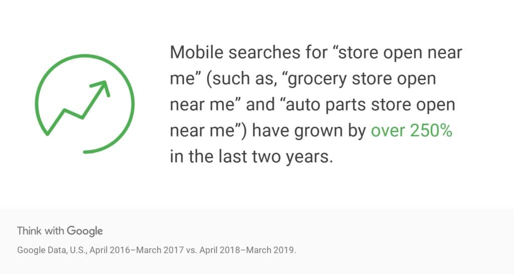
Mobile website design best practices that are working right now on the web that you can take advantage of to beat your competition.
Aaron Konzelman: Hey. And so, you told me earlier, we were talking about, this is one of my biggest pet peeves is trying to look up a company or an offer, and they don’t have a real mobile site, and you have to scroll and scroll and move. Ugh, bugs the heck out of me.
Gary Bernier: Bugs the heck out of you, bugs the heck out of everybody.
Aaron Konzelman: Yeah.
Gary Bernier: And so, business owners, what are you waiting for?
Aaron Konzelman: Yes.
Gary Bernier: So if you take a look at this first slide, this is a retailer’s traffic by device. 2018, double the number of mobile visits from the year before. Right?
Aaron Konzelman: Oh, yeah. Oh yeah.
Gary Bernier: So this is not a small thing that’s going on. Everybody is using their mobile phone, including you guys. So when did it change? It changed mid-2017. Looked at all the clients, the crossover point, mid-2017. Google was running around telling everybody, “This is going to happen.” And they were saying that’s when it was going to happen. Here’s Home Renovator, same thing, a huge increase in mobile, right?
Aaron Konzelman: Yeah.
Gary Bernier: So this is happening. That experience you are having is because you’re just … normal consumer behavior.
Aaron Konzelman: Yeah.
Mobile Website Design Best Practices
Mobile website design best practices are bolded for you below:
Gary Bernier: Consumers hate pop-ups, pop-overs, slow to low and poor navigation. On your mobile, the last thing you want is something popping over the mobile screen …
Aaron Konzelman: Oh-
Gary Bernier: … instantly.
Aaron Konzelman: I’ll instantly try to find another site or another vendor if pop-ups keep coming up on a site on my mobile.
Gary Bernier: Right. So the stuff you’ve been running on your desktop site for popping up chat and popping over chat, you cannot do that on mobile because people will do what Aaron said, they will just leave. So turn that stuff off.
Gary Bernier: Consumers love the sites that are quick to load, nice and snappy, answer their questions quickly because you are on your mobile phone, there’s only so much real estate, and guide them to that next logical step, whatever that happens to be. All right?
Gary Bernier: So here’s a couple of mobile website design tips for people. There is no cursor on a phone. So we got to go back to the old days and we got to underline our links.
Aaron Konzelman: Yes. Yes.
Gary Bernier: So if you want somebody to click on it, you’ve got to make it obvious that they got to click on it. You should make it look more like buttons. And you should also keep the header at the top. So some websites, mobile websites, you scroll, the header disappears, you lose the navigation.
Gary Bernier: This next one, this was DHL, this website, and I just love that because it looked like six buttons, it looks like a mobile app, and it was a website. And I went, “That’s brilliant.”
Gary Bernier: So yeah, you need to reduce the amount of text on the page, the number of pictures, and use icons because they’re quicker. And what do you want when you go to the mobile website?
Gary Bernier: This is a shot of Goettl’s website. Wizard of Ads Partner – Cedric Yao put this together, and when I first saw it, I knew it was brilliant.
Aaron Konzelman: It’s clean.
Gary Bernier: It’s clean. The phone number’s right there. That’s what you want. You want them to be able to click on that and call you, you want that conversion. They want to know your hours, they want your address, your direction, super-simple navigation, and provide clear instructions as to how to get to that next thing.Gary Bernier: So those are the things that, if you want to make your site work, you need to do. And so, business owners, right now, pull out your phone. Go to your website. Here’s the test. How easy it for you to click to call? Can you rapidly find the information that a customer might be looking for, or do you want to hit the back button? Now go check and look at what your competition’s doing. Are they are beating you, or have you got a window of opportunity to get your mobile site done before they do because they’re still sleeping? And in Jig’s video, he talked about these two tools, Bing’s Mobile Test and Google’s Mobile Test. So if you have a mobile site and you want to make sure that it’s going to do the right things for you, use one of the testing tools.Gary Bernier: But, guys, seriously, look at your site as if you were a customer, using your device, that’s the moral of the story. And then there’s a couple of tips in there to straighten out your mobile website design.

Aaron Konzelman: Beautiful. Simple, to the point, man. Awesome.
Gary Bernier: Well, we don’t want people having that experience you have with your phone, Aaron, that’s it, man. We want to stop that.
Aaron Konzelman: Rock and roll. All right, we’ll see you all next time.