Best Landing Page Design
The best landing page design is the one that helps you convert visitors into prospects or customers.
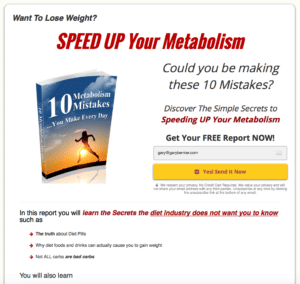
A landing page is the page that you use to convert visitors into buyers. It is your money page. So the best landing page design is the design that grabs attention, quickly tells your story and compels your visitor to take action. There are many things that make a landing page work, including the use of a headline and copy. But the layout and design are critical, so in this article I will cover the key design elements.
1. Attention-grabbing headline
Since you have only seconds to grab your visitor’s attention, a great headline is critical to success. The headline must be large, prominent and across the top. The headline needs to be large and proud. It is the hook to pull your visitors in.

2. Graphics of your offer
People want to see what you have to offer. The more concrete you can make the offer, the higher your conversion will be. Show them a picture. Even if it is an eBook, you can show a picture of a book and its cover. If it is an audio, show a picture of CDs. Don’t make them read to know what you are offering. Give them a picture.
3. Horizontal opt-in bar
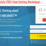
Have a horizontal opt-in bar under your attention-grabbing headline. The headline may be enough to get someone to take action. If they want to buy, let them buy right away.
4. Compelling short form copy
You have only a short time to provide the necessary information to persuade your visitor to take action. Use of bullet points and short form copy are highly effective with landing pages.
5. “Clickable Images.”
We have been conditioned to click on images. This is a great opportunity to add messages to your landing page. Have a message pop-up when an image is clicked. Here is my promise to you. Put some tracking on this, I guarantee that you will have people click on the images. If they don’t, there is a beer on me.
6. Compelling captions under each component
After your headline, captions are the second most read element on a landing page. So the best landing page design uses captions to further communicate your offer to your visitor. Use your captions wisely and consider them as part of your message. There is more on this later in the article when we look at the readership path.
7. Below the fold opt-in
You will have visitors who will read your entire landing page, and only after reading your entire offer will they want to take action. Don’t make your visitor have to scroll up to find the opt-in button. Have an opt-in button below the fold at the end of your message. Make it easy to take action.
8. Privacy policy and terms of service (disclaimer)
If you are planning on using Google Ads to drive traffic to your landing page, you must read this tip. It will save you time and aggravation. Google wants you to have a privacy policy and terms of service on your landing page. If you do not do this, the ad will be rejected. The fun thing is that Google will not tell you why or provide details of what is needed in the privacy policy or terms of service.
Best Landing Page Design Considers Eye Path
The best landing page design also incorporates eye path. Eye path studies have shown over and over again that the eye moves across the top and then down the right. There is a reason why Google puts ads at the top and on the right of the page. This is where the money is made, and Google knows how to make money. So your landing page should be designed to incorporate this motion.
The best landing page design will have the eye go across the headline and hero shot, move down over an opt-in button, hit pictures with captions (remember the power of the captions) and then hit a second opt-in button.


